
popup_shapes ?
Popup Shapes for Notifications and tooltips.
Shapes
TOP
| LEFT | CENTER | RIGHT |
|---|---|---|
 |
 |
 |
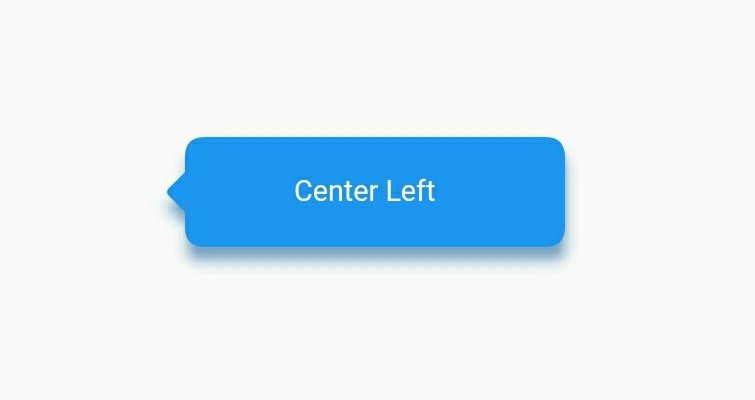
CENTER
| LEFT | RIGHT |
|---|---|
 |
 |
BOTTOM
| RIGHT | CENTER | LEFT |
|---|---|---|
 |
 |
 |
How to use
- import following dependencies in pubspec.yaml
popup_shape:
    git:
      url: https://github.com/MR0100/popup_shapes.git
- explanations
/// bgColor : it is use for background color of the shape.
/// shadowColor : it is use for shadow color of shape.
/// shadowRadius : it is define spred radius of shadow.
/// position : it define the position of arrow.
/// [TopLeft, TopCenter, TopRight, CenterRight, BottomRight, BottomCenter, BottomLeft, CenterLeft]

PopupShapes(
  width: 200,
  height: 60,
  child: Text(
    'Bottom Left',
    style: TextStyle(
      color: Colors.white,
      fontSize: 16.0,
      ),
    ),
  bgColor: Colors.teal,
  position: PopupArrowPosition.BottomLeft,
  shadowRadius: 5.0,
  shadowColor: Colors.teal,
)
Example
import 'package:flutter/material.dart';
import 'package:popup_shape/popup_shapes.dart';
void main() => runApp(MyApp());
class MyApp extends StatelessWidget {
@override
Widget build(BuildContext context) {
return MaterialApp(
home: Scaffold(
body: Center(
child: Container(
child: PopupShapes(
width: 200,
height: 60,
child: Text(
'Bottom Left',
style: TextStyle(color: Colors.white, fontSize: 16.0),
),
bgColor: Colors.teal,
position: PopupArrowPosition.BottomLeft,
shadowRadius: 5.0,
shadowColor: Colors.teal,
),
),
),
),
);
}
}