
flutter_responsive_scale
A flutter plugin for adapting screen and font size.Let your UI display a reasonable layout on different screen sizes by using device scale!
Demo

flutter_responsive_scale.mp4
Features
- Responsive UI
- Simple UI Utils
- Easy to use
- Responsive Query option – fontScale, yScale and width scale
Usage
Add dependency
Please check the latest version before installation.
If there is any problem with the new version, please use the previous version
dependencies:
  flutter:
    sdk: flutter
  # add flutter_responsive_scale
  flutter_responsive_scale: ^{latest version}
Add the following imports to your Dart code
import 'package:flutter_responsive_scale/flutter_responsive_scale.dart';
Property
| Property | Type | Parameter | Description |
|---|---|---|---|
| context.Scale(size) | Function | double required | Pixels scaled per device from design. Where One pixel on a 160px screen equals two pixels on a 320px screen. Also and alias for scaleX. |
| context.fontScale(14) | Function | double required | Relative to the font-size setting of the actual device. |
| context.scaleY() | Function | double required | Reference device configuration – Reference width of device. Defaults to 414px ( iPhone XS Max) Reference height of device. Defaults to 896px ( iPhone XS Max), Should allow automatic scaling of font sizes. Defaults to true |
| ResponsiveScaleConfig | Clase | height (double), width (double), allowFontScaling (bool – true) | Pixels scaled per device from design in the Vertical direction. Where One pixel on a 160px screen equals two pixels on a 320px screen. |
Initialize and set the fit size and font size to scale according to the system’s “font size” accessibility option
Please set the scale config of the design draft before use, the width, height of the design draft and allowFontScaling.
class MyApp extends StatelessWidget {
  const MyApp({super.key});

  @override
  Widget build(BuildContext context) {
    return ResponsiveScale(
      config: const ResponsiveScaleConfig(),
      child: MaterialApp(
        title: 'Responsive scale demo',
        theme: ThemeData.dark(),
        home: const ScaleTestPage(
          title: 'Hi , Flutter dev - ',
        ),
      ),
    );
  }
}
Examples
import 'package:flutter/material.dart';
import 'package:flutter_responsive_scale/flutter_responsive_scale.dart';
void main() => runApp(const MyApp());
class MyApp extends StatelessWidget {
const MyApp({super.key});
@override
Widget build(BuildContext context) {
return ResponsiveScale(
config: const ResponsiveScaleConfig(),
child: MaterialApp(
title: 'Responsive scale demo',
theme: ThemeData.dark(),
home: const ScaleTestPage(
title: 'Hi , Flutter dev - ',
),
),
);
}
}
class ScaleTestPage extends StatelessWidget {
const ScaleTestPage({Key? key, required this.title}) : super(key: key);
final String title;
@override
Widget build(BuildContext context) {
return Scaffold(
appBar: AppBar(title: Text(title)),
body: SingleChildScrollView(
padding: EdgeInsets.symmetric(
horizontal: context.scale(7),
),
child: Center(
child: Column(
children: <Widget>[
SizedBox(height: context.scale(16)),
Text(
'Designed at ${ResponsiveScale.of(context).width} x ${ResponsiveScale.of(context).height}',
style: TextStyle(
fontSize: context.fontScale(16),
),
textAlign: TextAlign.center,
),
SizedBox(
height: context.scale(16),
),
Container(
alignment: Alignment.topLeft,
padding: EdgeInsets.only(
bottom: context.scaleY(10),
),
child: Text(
'With scale box',
style: TextStyle(
fontSize: context.fontScale(14),
),
textAlign: TextAlign.left,
),
),
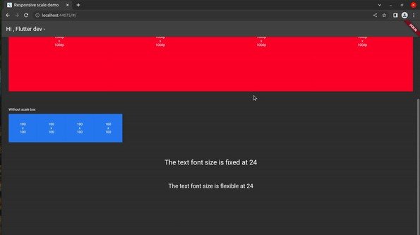
RenderBoxes(
size: Size.square(
context.scale(100),
),
color: Colors.red,
label: const ["100dp", "100dp"],
),
SizedBox(
height: context.scale(16),
),
Container(
alignment: Alignment.topLeft,
padding: EdgeInsets.only(
bottom: context.scaleY(10),
),
child: Text(
'Without scale box',
style: TextStyle(
fontSize: context.fontScale(14),
),
textAlign: TextAlign.left,
),
),
const RenderBoxes(
size: Size.square(
100,
),
color: Colors.blue,
label: ["100", "100"],
),
SizedBox(
height: context.scale(16),
),
const Text(
'The text font size is fixed at 24',
style: TextStyle(
fontSize: 24,
),
textAlign: TextAlign.center,
),
SizedBox(
height: context.scale(16),
),
Text(
'The text font size is flexible at 24',
style: TextStyle(
fontSize: context.fontScale(24),
),
textAlign: TextAlign.center,
),
SizedBox(
height: context.scale(48),
),
],
),
),
),
);
}
}
class RenderBoxes extends StatelessWidget {
const RenderBoxes({required this.size, this.color, required this.label, Key? key}) : super(key: key);
final Size size;
final Color? color;
final List<String> label;
@override
Widget build(BuildContext context) {
return Row(
children: List.generate(
4,
(_) => Container(
width: size.width,
height: size.height,
color: color,
child: Center(
child: Text(
label.join("\nx\n"),
style: TextStyle(
fontSize: context.fontScale(14),
),
textAlign: TextAlign.center,
),
),
),
),
);
}
}
Motivation
Main motivation behind this package was one of my project feature was required a responsive UI and simple device query for different platform.
Authors
🚀 About Me
I’m a flutter developer…
🔗 Links